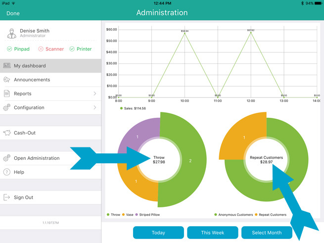
Using the Dashboard
The data that is displayed on the Dashboard is dependent upon the time
frame selection that you make on the right pane. The Today,
This week and Select
Month buttons enable you to make a time frame selection, and the
graphs adjust accordingly. Follow the guidelines below to determine how
time frame selection changes the displayed data.
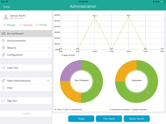
Today – This is the
default selection when the Dashboard is first accessed. The values
displayed are as of today’s calendar date from midnight to midnight.
This week – Tap this
button to see the values that represent the current calendar week
from Monday to Sunday.
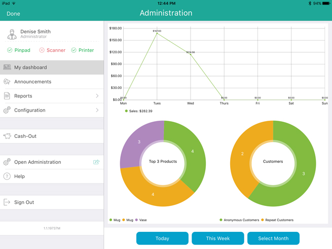
NOTE:
Due to the nature of this type of time frame, it is more valuable to view
the Dashboard closer to the end of the week, as viewing it early on a
Monday morning would not provide any discernable data.
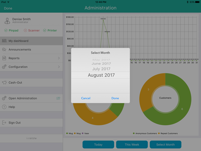
Select Month – When
you tap this button, the Select Month selector appears. Scroll up/down
to select a month, then tap a year, then tap Done.
The displayed values are the totals for the selected month.
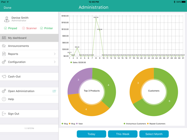
For more information on the sales data in the circle charts, tap on
a slice in either the Top 3 Products
or Customers charts. Gross sales
figures appear in the middle of the circle. Tap other slices to see figures
for the other products or customers.
Related Topics
The Dashboard
The
PAYD Administration Dashboard (In Store)
Transactions
on the Mobile App