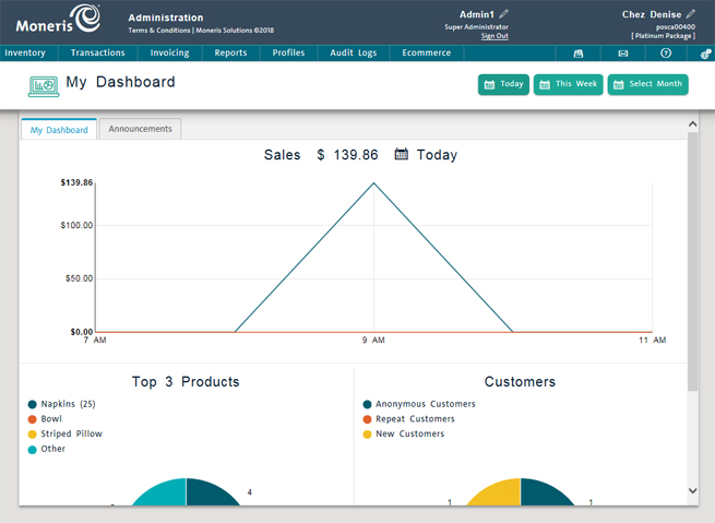
The PAYD Administration main screen features a sales Dashboard, a user friendly summary of sales and business trends that allow you to view and manage your business with ease. The Dashboard provides access to real-time daily, weekly and monthly reports summaries such as:
Sales – total net sales as generated in your location.
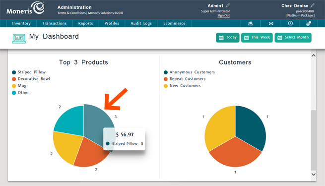
Top 3 Products - displays the top 3 products sold based on quantity, as well as how those top 3 performed against all other products sold (Other).
Customers - displays the transaction distribution between anonymous customers, new customers (registered today, this week, or in the selected month), and repeat customers (customers that have been registered in the past and were selected during the transaction).

The data that is displayed on the Dashboard is dependent upon the time frame selection that you make at the top of the screen. The Today, This week and Select Month buttons enable you to make a time frame selection, and the graphs adjust accordingly. Follow the guidelines below to determine how time frame selection changes the displayed data.
Today – This is the default selection when the Dashboard is first accessed. The values displayed are as of today’s calendar date from midnight to midnight.
This week – Click this button to see the values that represent the current calendar week from Monday to Sunday.
NOTE: Due to the nature of this type of time frame, it is more valuable to view the Dashboard closer to the end of the week, as viewing it early on a Monday morning would not provide any discernable data.
Select Month – When you click this button, a date selector popup appears. Click the Choose Month and Choose Year drop-down menus and select the month and year respectively. The displayed values are the totals for the selected month.
You can also hover over one of the slices in the pie charts to see the gross sales amount for that slice.

The Dashboard (Mobile)
Using the Dashboard (Mobile)