Click on the Widgets tab at the top of the screen.
The Text/Image Hyperlink Widget provides you with the opportunity to convert text phrases or images into hyperlinks. A Hyperlink will enable a website user to be transported to a different page or a different site simply by clicking on it.
Adding this widget to your website is a two-step process:
Add elements to the widget. When adding text elements to the widget, it is possible to use an HTML text editor to edit the way the text will appear on the site.
Follow the instructions below to create the text/image hyperlink widget.
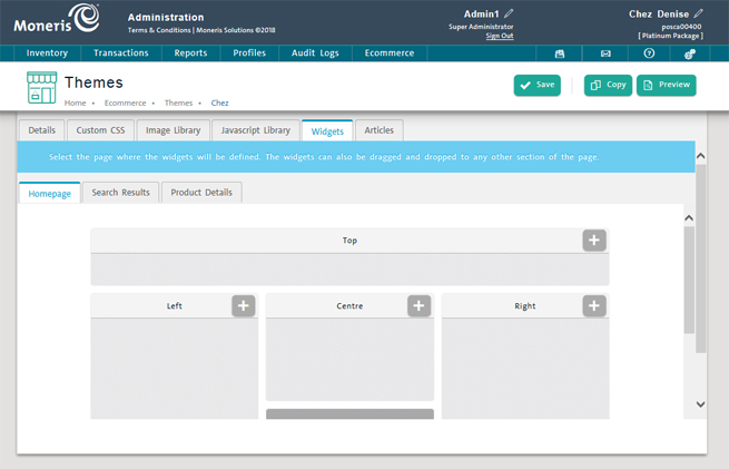
From the PAYD Administration main screen, click Ecommerce.
On the Ecommerce menu, under the Site section, click Themes.
In the eCommerce - Themes screen, select a theme in the list.
The Theme profile screen appears.
Click on the Widgets tab at the top of the screen.
Select the tab which represents to page on which you want your widget to appear. Choose from:
● Homepage - This is the default tab selected. Homepage represents your ecommerce website's home page. This is the page that customers will see first when they arrive at your website.
● Search Results - This tab represents a Search Results page that will appear once a customer has used search functionality on the ecommerce website to search for something.
● Product Details - This tab represents a product details page that is unique to each product clicked on from the homepage or from search results. When a customer clicks on a product, the product details page loads up.
Once you have selected the tab, use the mock-up of the web page to select the area of the web page on which you want the widget to appear. Choose from:
● Top
● Left
● Centre
● Right
● Bottom
● Footer
● Absolute Positioning.
In the area of the page where you wish to add the widget, click the + button.
The New widget screen appears.
Select Texts/Images Hyperlinks from the Widget Type drop-down menu.
Enter a name for the widget in the Name field.
Click the Next button.
A widget profile screen appears. The name field will already be populated by whatever you entered in step 5.
Enter a widget description in the Description field.
Complete the fields in the Details section as follows:
● Optional div ID - the div ID is an alphanumeric identifier for the widget. This identifier is used by CSS to refer to the widget. The value entered here should be unique (e.g. do not use this div ID for multiple widgets).
● Online - use this drop-down menu to select whether or not the widget will be visible on your ecommerce website. Select Yes to make the text/image hyperlink widget visible; select No to remove it from your site.
● Context - use this drop-down menu to select which pages of the ecommerce website will display the text/image hyperlink widget. Select All to have it appear on all ecommerce pages; select Homepage to have it appear only on the homepage; select Search Results to have it appear only on the results of a product search; select Product Details to have it appear only on a product's details page.
NOTE: The Context options are mutually exclusive - you cannot choose to have a Widget appear in Homepage and Search Results. It can only appear in one place or all places.
● Alignment - use this drop-down menu to select whether you'd like the widget to be aligned horizontally or vertically (by selecting Horizontal or Vertical respectively).
NOTE: When using the Absolute Positioning option, please be aware that this works in tandem with the Optional div ID entered above, therefore the div ID is required to use this display location. In the CSS file, you can refer to the widget by its div ID and specify a coordinate on the page to place the widget (e.g. 300 pixels from the top, 200 pixels from the right).
Click the Save button to save the widget.
Refer to the Adding Elements to the Widget section below for the next steps in this process.
Use the Hyperlinks tab to add images or text, edit the HTML behind them and link the element to another web page.
NOTE: Before you begin, ensure that you have any image files that you are going to "link" saved on your computer's local hard drive.
Create the widget and save it.
Click on the Hyperlinks tab at the top of the widget profile screen.
In the Add Element section, click the ellipsis button ( ) to browse for an image file on your computer's hard drive.
The Choose File to Upload dialog box opens.
Locate the image you wish to use, select it and click the Open button.
Click inside the URL text field and type or paste in a web address you wish to link to.
Click the Save button on the bottom of the screen.
You can verify how the widget looks by previewing the page.
Create the widget and save it.
Click on the Hyperlinks tab at the top of the widget profile screen.
Click inside the URL text field and type or paste in a web address you wish to link to.
Click inside the HTML/Text Editor and type in a line of text you wish the link to display. Refer to the Using the HTML Text Editor section below for more information.
Click the Save button on the bottom of the screen.
You can verify how the widget looks by previewing the page.
● Refer to the Deleting Widgets topic for more information.
When you are adding a text hyperlink to your widget, you can use the HTML text editor to adjust how the text will appear on the page. Simply type your text into the text field in the middle of the screen, highlight portions of the text and then use the buttons on top of the screen to apply effects to the text you have highlighted.
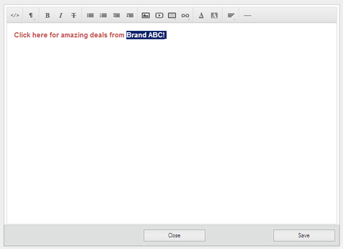
Use the table below to determine which functions the buttons perform.
|
This button: |
Performs this task: |
|
|
Shows the text in HTML. The HTML tags will be visible. Click the button again and the text reverts to normal and the HTML tags are hidden. |
|
|
Applies formatting styles to highlighted text e.g. Heading 1 style, Heading 4 style, Paragraph style etc. |
|
|
Applies Bold, Italic and/or Underlined style respectively to highlighted text. |
|
|
Sorts highlighted text into an unordered (bulleted) list placing a bullet for each carriage return (when the Enter key is pressed on the keyboard). |
|
|
Sorts highlighted text into an ordered (numbered) list placing a number for each carriage return (when the Enter key is pressed on the keyboard). |
|
|
Moves highlighted text one tab stop to the left (outdent). |
|
|
Moves highlighted text one tab stop to the right (indent). |
|
|
Inserts a table at the cursor position. Select the number of columns and rows in the Table dialog box that appears and click the Insert button. There are other options to add/delete rows and columns as needed. |
|
|
Inserts a hyperlink. |
|
|
Changes the colour of the highlighted text. Choose a colour from the colour palette that appears. |
|
|
Changes the background colour of the highlighted text. Choose a colour from the colour palette that appears. |
|
|
Changes the alignment of the highlighted text - left, centre, right or justify. |
|
|
Inserts a horizontal line at the cursor position. |